iNeedWorkwear
All guides / Buying guides

Buying guide · Embroidery artwork

Logos that stitch: the artwork rules.

Embroidery is drawing with a needle that refuses to draw anything smaller than a stitch. Most disappointing logo results were decided before the machine started — in artwork with hairline details, six-point text and gradients thread can't make. Here's what survives the needle, and how to prepare for it.

4–5 mm
Minimum legible letter height
No gradients
Thread is solid colour
Once
Digitise properly, reuse forever
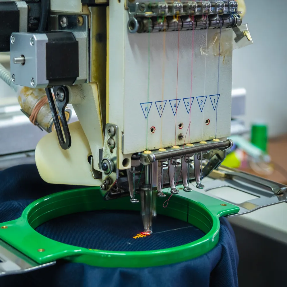
Multi-head embroidery machine stitching a logo
Buying logic, not sales copy Fabric and spec named Team quantities priced on request Trade accounts

The constraints

What thread can and can't do

The needle's alphabet has minimums: text below roughly 4–5 mm tall fills in and blurs — the registered-trademark symbol and web addresses are the classic casualties; fine lines below about a millimetre disappear or bulge; gradients don't exist in thread — a fade becomes stepped bands of solid colour, which a good digitiser designs deliberately or (better) the artwork avoids; and large solid fills get heavy, stiff and pucker-prone on light garments — outlines and partial fills wear better. Colour is genuinely excellent news: thread colour is vivid and permanent, standard palettes match most brand colours closely, and a dozen colours cost no more to run than two (the machine just changes thread).

The digitising step is where quality lives: converting artwork to a stitch file is a craft decision about stitch types, directions, densities and underlay per fabric — which is why the same logo needs adjusting between a stable twill and a stretchy pique, and why the digitised file, done once and kept, is what guarantees every future batch matches (the one-off cost our pricing guide explains). Supply the cleanest artwork you own — vector (.ai/.eps/.svg) ideally, or the largest sharp image — plus brand colour references, and say which garments it's going on.
The rules

Artwork pre-flight checks

CheckThe ruleWhy
Smallest text≥ 4–5 mm stitched height — drop straplines that break itFills in below the needle's resolution
Line weights≥ ~1 mm at final sizeThinner vanishes or blobs
Gradients & photo effectsRedesign as solid-colour zonesThread has no opacity
Final size by placementLeft chest ~80–100 mm wide; caps ~55–65 mmCap panels are the tightest canvas
File suppliedVector preferred; big sharp raster acceptableDigitisers redraw from what they can see

Good to know

Three facts that save revisions

Simplify wins
The strongest embroidered logos are the simplest versions of the brand — icon plus name beats the full crest
Fabric changes stitches
The same file adjusts between polo, softshell and <a href='choosing-work-jackets.html'>shell jackets</a> — membrane fabrics get patches or backing
Ask for a stitch-out
A photographed sample on the actual garment before the batch run is normal practice — request it

Questions

Artwork FAQ

What file format is best for embroidery?

Vector formats (.ai, .eps, .svg, or vector PDF) digitise cleanest because every shape is mathematically defined. Failing that, the largest, sharpest raster image you have. The digitiser converts it once into a stitch file, which is then reused identically for every future order.

Why does small text embroider badly?

A stitch has physical width — below roughly 4–5 mm letter height, letterforms fill in and read as texture rather than text. Straplines, web addresses and ® symbols are the usual casualties; the fix is dropping or enlarging them in the workwear version of the logo.

Can embroidery do gradients?

Not literally — thread is solid colour. Digitisers can suggest gradients with stepped bands or directional stitching, but the honest answer is to redesign fades as solid zones for the stitched version. Most brands run a simplified 'embroidery version' of their logo for exactly this reason.

List written — kit it out.

Everything in these guides is stocked, embroiderable and priced for teams.